Complementary Colour Schemes That Will Make Any Room Pop
Complementary colour schemes are an essential element in interior design and visual planning because they create harmony and striking contrast. These schemes feature colours that are directly opposite each other on the colour wheel, such as blue with orange or red with green.
When used appropriately, these combinations enhance the visual impact of any space, improve balance, and help highlight important design elements. Whether it’s for homes, decor accents, branding, or ambience creation, complementary colours make spaces more appealing, engaging, and memorable.
Understanding Colour Theory in Complementary Schemes
To use complementary colours effectively, it is important to understand the colour wheel and how colours are formed. The three tiers of colour—primary, secondary, and tertiary—form the foundation of good design. Primary colours include red, yellow, and blue. These colours cannot be produced by mixing other colours and act as the base for all other hues.
Secondary colours are created by blending two primary colours in equal amounts. Green comes from mixing blue and yellow, orange from red and yellow, and purple from red and blue. These hues expand the available palette and help designers build visually pleasing interiors.
Tertiary colours are made by mixing a primary colour with an adjacent secondary colour. Examples include blue-green, yellow-orange, red-purple, blue-purple, yellow-green, and red-orange. These shades bring greater depth, subtlety, and sophistication to colour schemes.
Benefits of Using Complementary Colour Schemes
Complementary colours offer a range of advantages when applied mindfully in design. One of the most significant benefits is the high visual contrast they create, which draws attention instantly and makes design elements stand out. These colour pairings also evoke emotional responses, as the balance of warm and cool tones creates visual energy and harmony. Another advantage is improved readability and clarity, especially in spaces where contrast is necessary for visibility, such as text, walls, signage, or decor.
Complementary colours contribute to overall aesthetic balance as well by preventing designs from appearing flat or monotonous. Their versatility allows them to be used across interiors, furnishings, and accessories. They also help guide the viewer’s eyes and highlight specific features such as accent walls, furniture, or artwork.
Popular Complementary Colour Combinations for Homes
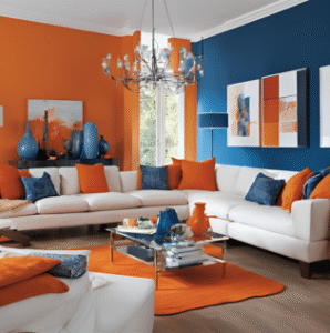
Several complementary combinations work wonderfully in residential spaces. Blue and orange form a classic pair that feels lively and balanced. Using blue on walls or large furniture combined with orange accents like artwork or cushions creates a refreshing look, great for living areas or kitchens.
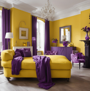
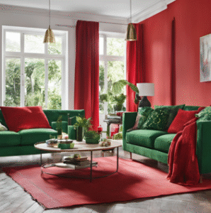
Red and green are another bold combination that brings energy and vibrance to a room. Muted reds for walls or upholstery with green plants or decorative pieces can enhance dining rooms or office spaces. Yellow and purple offer a luxurious and elegant pairing; soft yellow walls paired with purple accessories make bedrooms and bathrooms feel warm and regal.
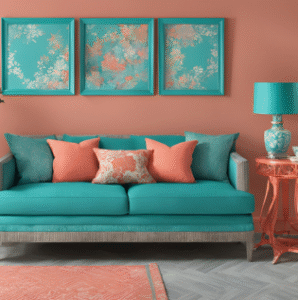
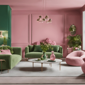
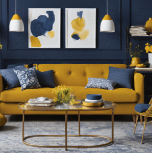
Teal and coral are perfect for creating a modern, fresh atmosphere in family rooms or outdoor spaces. Teal can be used for dominant areas, while coral appears in accents like throws, vases, or furniture. Navy and mustard give off a timeless yet bold appeal. Navy walls or sofas combined with mustard curtains or cushions work well in formal areas and reading spaces. Pink and green bring a garden-inspired charm to rooms such as nurseries or sunrooms. Soft pink walls with leafy green elements create an inviting and calm environment.
Preparing a Room for Painting: Step-by-Step
Before painting a room, proper preparation ensures a smooth finish and long-lasting results. The first step is gathering the necessary supplies, such as rollers, paint trays, painter’s tape, drop cloths, and primer. Once materials are ready, the room should be cleared of furniture and decor or items can be grouped in the centre and covered securely.
Next, the floors should be protected using cloths or plastic sheets, and trims, windows, and doors must be taped to avoid paint spills. Cleaning the walls is essential to remove dust, stains, or grease, and the surface should fully dry before proceeding. Any holes or cracks in the walls need to be repaired using spackle, and once dry, the surface should be sanded to create an even base.
Switch plates and outlet covers should be removed for a neater finish. Primer is recommended when covering dark colours, stained walls, or when making a major colour shift. After priming, painter’s tape should be applied along edges and corners for clean lines. Proper ventilation is also crucial, so windows and doors should be opened to allow airflow and reduce paint fumes. Finally, brushes, ladders, and paint trays should be set up for an efficient workflow.
How ABI Supports Your Home Colour Goals
AdwaitBirlaInductryAbi (ABI) offers a range of solutions for interiors and wall finishes, helping homeowners create spaces that reflect both personality and practicality. From colour selection guidance to finish suggestions and durable application techniques, ABI ensures visually appealing and long-lasting results. Whether planning a makeover for a single room or an entire home, ABI provides expertise and quality products to bring your vision to life.
1 Comment
Mansi
October 15, 2025Recently we paint our house and it’s commendable the finish, the shine everything. Genuanl recommended.